15.2 Temperature versus Humidity
15.2.1 Goal
You want to create a temperature versus humidity comfort plot:
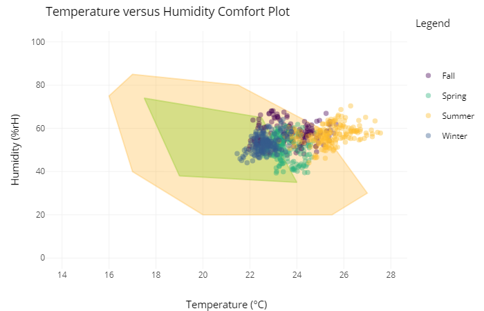
Figure 15.4: Temperature versus Humidity Comfort Plot
15.2.2 Data Basis
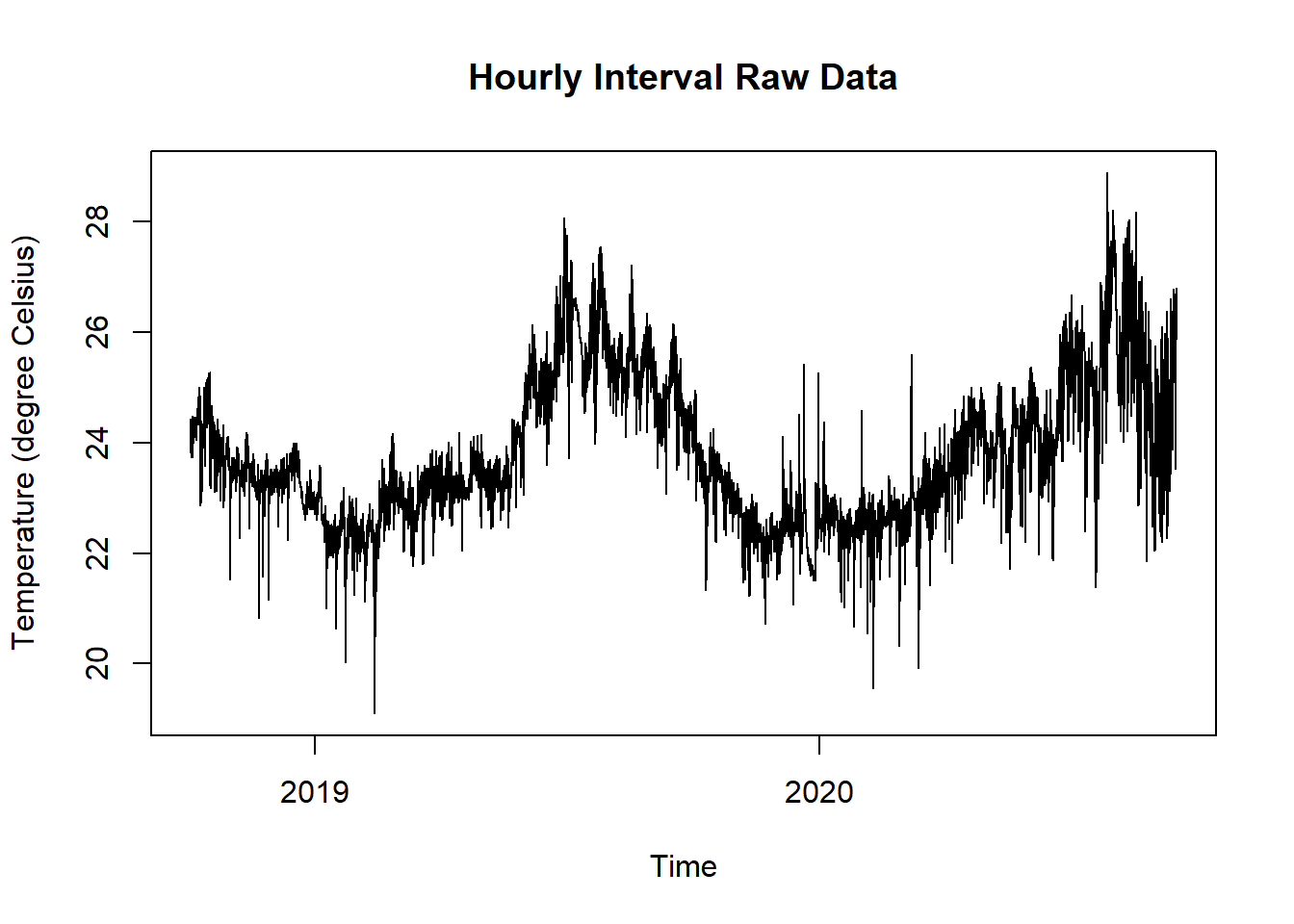
Figure 15.5: Raw Data Temperature and Humidity for Temp vs. Hum Comfort Plot
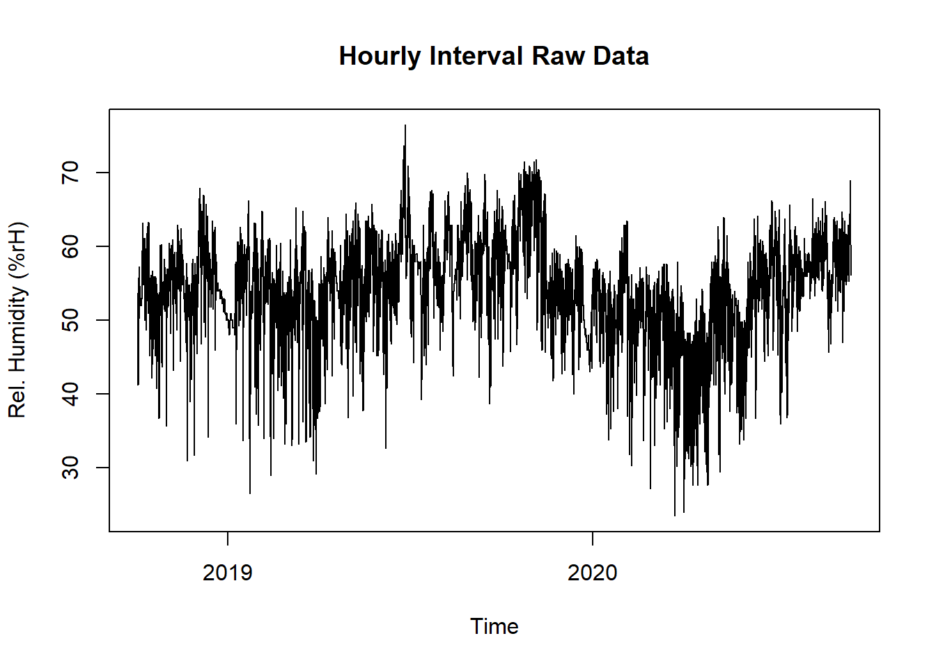
Figure 15.6: Raw Data Temperature and Humidity for Temp vs. Hum Comfort Plot
15.2.3 Solution
Create a new script, copy/paste the following code and run it:
library(redutils)
library(dplyr)
library(lubridate)
library(plyr)

# read and print data
data <- read.csv("https://github.com/hslu-ige-laes/edar/raw/master/sampleData/flatTempHum.csv",
                 stringsAsFactors=FALSE,
                 sep =";")

# select temperature and humidity and remove empty cells
data <- data %>% select(time, FlatA_Temp, FlatA_Hum) %>% na.omit()
colnames(data) <- c("time", "tempRaw", "humidityRaw")

# create column with day for later grouping
data$time <- parse_date_time(data$time, "YmdHMS", tz = "Europe/Zurich")
data$day <- as.Date(cut(data$time, breaks = "day"))

# calculate daily mean of temperature and humidity
data <- data %>%
  group_by(day) %>%
  dplyr::summarize(temperature = mean(as.numeric(tempRaw), na.rm = TRUE),
                   humidity = mean(as.numeric(humidityRaw), na.rm = TRUE)
  ) %>%
  ungroup() %>%
  na.omit()

# calculate season
data$day <- parse_date_time(data$day, "Ymd", tz = "Europe/Zurich")
data$season <- getSeason(data$day)

# create plot
# axis properties
minx <- floor(min(14.0,min(data$temperature)))
maxx <- ceiling(max(28.0,max(data$temperature)))
miny <- 0.0
maxy <- 100.0

# comfort zones
df.zoneNotComfortable <- data.frame(Temp = c(minx,minx,maxx, maxx, minx),
                                    Hum = c(miny,maxy,maxy, miny, miny),
                                    Zones = "uncomfortable")
df.zoneStillComfortable <- data.frame(Temp = c(20,17,16,17,21.5,25,27,25.5,20),
                                      Hum = c(20,40,75,85,80,60,30,20,20),
                                      Zones = "Still comfortable")

df.zoneComfortable <- data.frame(Temp = c(19,17.5,22.5,24,19),
                                 Hum = c(38,74,65,35,38),
                                 Zones = "Comfortable")

df.zones <- rbind.fill(df.zoneNotComfortable, df.zoneStillComfortable)
df.zones <- rbind.fill(df.zones, df.zoneComfortable)

plot <- ggplot() +
  geom_polygon(data = df.zoneStillComfortable,
               aes(x = Temp,
                   y = Hum),
               alpha = 0.25,
               color = "orange",
               fill = "orange",
               name = "Comofort Zone") +
  geom_polygon(data = df.zoneComfortable,
               aes(x = Temp,
                   y = Hum),
               alpha = 0.4,
               color = "yellowgreen",
               fill = "yellowgreen") +
    geom_point(data = data,
             aes(x = temperature,
                 y = humidity,
                 fill = season,
                 colour = season,
                 text = paste0("Temp:    ", sprintf("%.1f \u00B0C", temperature),
                                 "<br />Hum:     ", sprintf("%.1f %%rH", humidity),
                                 "<br />Date:     ", day,
                                 "<br />Season: ", season)
                 ),
             alpha = 0.4) +
  ggtitle("Temperature versus Humidity Comfort Plot") +
  labs(x = "\nTemperature (\u00B0C)",
       y = "Humidity (%rH)\n",
       fill = "",
       colour = "Legend") +
  scale_x_continuous(breaks = seq(minx, maxx, 2),
                     limits = c(minx, maxx)) +
  scale_y_continuous(breaks = seq(miny, maxy, 20),
                     limits = c(miny, maxy)) +
  scale_color_manual(values = c("#440154", "#2db27d", "#febc2b", "#365c8d")) +
  scale_fill_manual(values = c("#440154", "#2db27d", "#febc2b", "#365c8d")) +
  theme_minimal()

# interactive chart
ggplotly(plot, tooltip = "text")