14.2 Sum Frequency Hours
14.2.1 Goal
You want to create a sum frequency plot of a temperature series for each hour in a year:
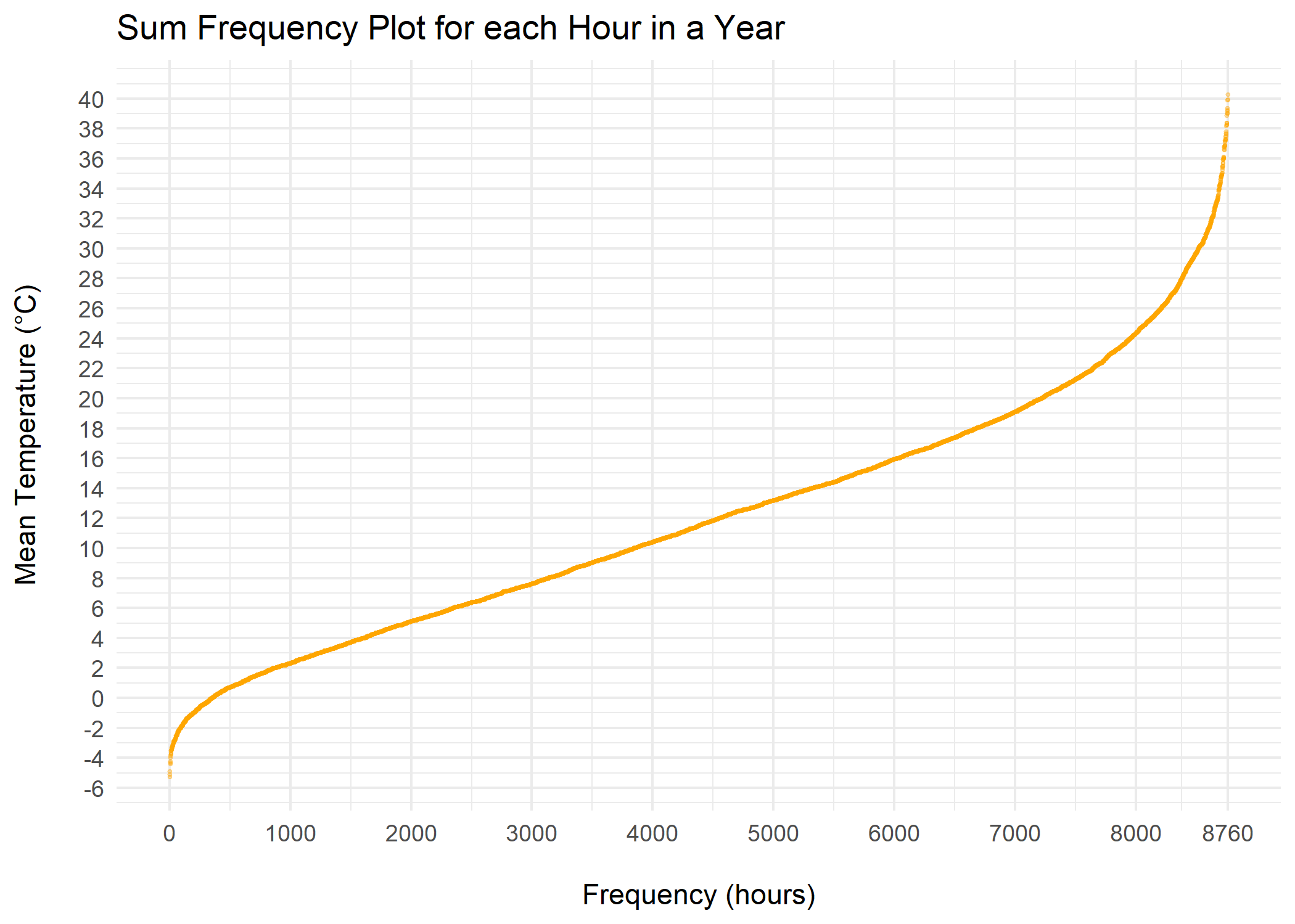
Figure 14.3: Sum Frequency Plot Temperature
14.2.2 Data Basis
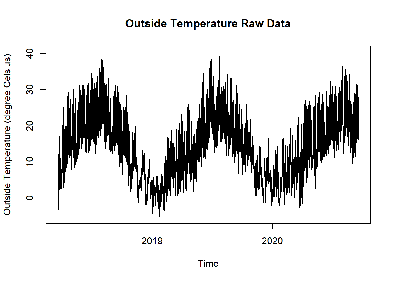
Figure 14.4: Outside Temperature Raw Data for Sum Frequency Hours Plot
14.2.3 Solution
Create a new script, copy/paste the following code and run it:
library(ggplot2)
library(plotly)
library(dplyr)
library(lubridate)
library(zoo)

# load time series data and aggregate daily mean values
df <- read.csv("https://github.com/hslu-ige-laes/edar/raw/master/sampleData/centralOutsideTemp.csv",
               stringsAsFactors=FALSE,
               sep =";")

df$time <- parse_date_time(df$time,
                           order = "YmdHMS",
                           tz = "Europe/Zurich")

# rename columns
colnames(df) <- c("time", "value")

df$day <- as.Date(cut(df$time, breaks = "day"))
df$hour <- as.POSIXct(cut(df$time, breaks = "hour"), tz = "Europe/Zurich")
df$year <- year(df$time)

# filter year

# edit year!!!
filterYear <- "2019"

df <- filter(df, year == filterYear)

df <- df %>%
  group_by(hour) %>%
  dplyr::summarise(meanValue = mean(value, na.rm = TRUE)) %>%
  ungroup()

# Fill missing values with NA
grid.df <- data.frame(hour = seq(as.POSIXct(paste0(filterYear, "-01-01 00:00:00"),
                                            tz = "Europe/Zurich"),
                                 as.POSIXct(paste0(filterYear, "-12-31 23:00:00"),
                                            tz = "Europe/Zurich"),
                                 by = "hours"))
df <- merge(df, grid.df, all = TRUE)

# replace NA with interpolation
df$meanValue <- na.approx(df$meanValue)

tempMin <- floor(min(df$meanValue, na.rm = TRUE))
tempMax <- ceiling(max(df$meanValue, na.rm = TRUE))

# create new data frame with sorted values
data <- data.frame(sort(df$meanValue))
data$hour <- as.numeric(row.names(data))
colnames(data) <- c("meanValue", "hour")

# static chart with ggplot
plot <- ggplot2::ggplot(data) +
  ggplot2::geom_point(aes(x = hour,
                          y = meanValue),
                      colour = "orange",
                      alpha = 0.3,
                      size = 0.5
                      ) +
  ggtitle("Sum Frequency Plot for each Hour in a Year") +
  ylab("Mean Temperature (\u00B0C)\n") +
  xlab("\nFrequency (hours)") +
  theme_minimal() +
  scale_x_continuous(breaks = append(seq(0, 8760, 1000), 8760)) +
  scale_y_continuous(breaks = seq(tempMin, tempMax, 2))

# interactive chart
plotly::ggplotly(plot)