13.3 Mean
13.3.1 Goal
Create a plot of mean data per week:
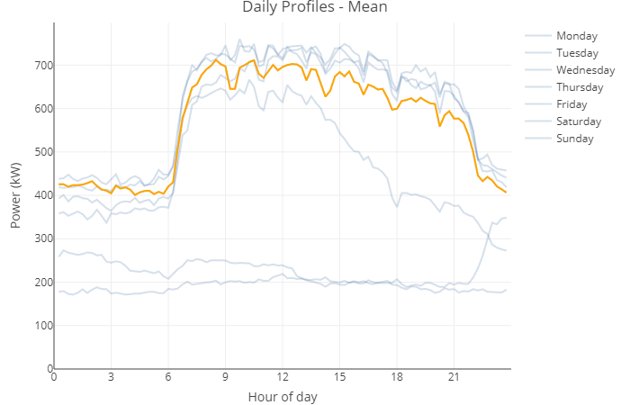
Figure 13.5: Mean Daily Profiles per Weekday
13.3.2 Data Basis
Energy consumption values of one whole year in an interval of 15mins.
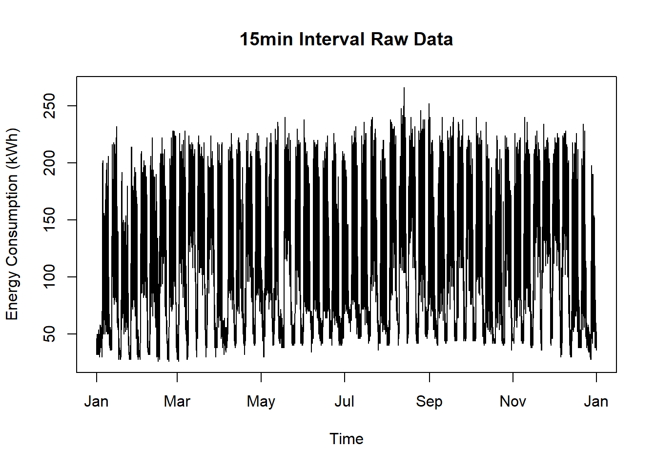
Figure 13.6: Raw Data for Decomposition Plot Short Term
13.3.3 Solution
Create a new script, copy/paste the following code and run it:
# change language to English, otherwise weekdays are in local language
Sys.setlocale("LC_TIME", "English")## [1] "English_United States.1252"library(plotly)
library(dplyr)
library(lubridate)
# load time series data
df <- readRDS(system.file("sampleData/eboBookEleMeter.rds", package = "redutils"))
df <- dplyr::mutate(df, value = value * 4)
# add metadata for later grouping and visualization purposes
df$x <- hour(df$timestamp) + minute(df$timestamp)/60 + second(df$timestamp) / 3600
df$weekday <- weekdays(df$timestamp)
df$weekday <- factor(df$weekday, c("Monday","Tuesday","Wednesday","Thursday","Friday","Saturday", "Sunday"))
df <- df %>% dplyr::mutate(value = ifelse(x == 0.00, NA, df$value))
# Calculate Mean value for all 15 minutes for each weekday
df <- df %>% group_by(weekday, x) %>% dplyr::mutate(dayTimeMean = mean(value)) %>% ungroup()
# shrink data frame
df <- df %>%
select(x, weekday, timestamp, dayTimeMean) %>%
unique() %>%
na.omit() %>%
arrange(weekday, x)
# plot graph with mean values
maxValMean <- max(df$dayTimeMean, na.rm = TRUE)*1.05
plot <- df %>%
highlight_key(~weekday) %>%
plot_ly(x=~x,
y=~dayTimeMean,
color=~weekday,
type="scatter",
mode="lines",
alpha = 0.25,
colors = "dodgerblue4",
text = ~weekday,
hovertemplate = paste("Time: ", format(df$timestamp, "%H:%M"),
"<br>Mean: %{y:.0f}")) %>%
# workaround with add_trace to have fixed y axis when selecting a dedicated day
add_trace(x = 0, y = 0, type = "scatter", showlegend = FALSE, opacity=0) %>%
add_trace(x = 24, y = maxValMean, type = "scatter", showlegend = FALSE, opacity=0) %>%
layout(title = "Daily Profiles - Mean",
showlegend = TRUE,
xaxis = list(
title = "Hour of day",
tickvals = list(0, 3, 6, 9, 12, 15, 18, 21)
),
yaxis = list(
title = "Power (kW)",
range = c(0, maxValMean)
)
) %>%
highlight(on = "plotly_hover",
off = "plotly_doubleclick",
color = "orange",
opacityDim = 0.7,
selected = attrs_selected(showlegend = FALSE)) %>% # this hides elements in the legend
plotly::config(modeBarButtons = list(list("toImage")), displaylogo = FALSE)
# show plot
plot