9.3 Density Plot
9.3.1 Goal
You want to create a density plot of a temperature series with the mean value as vertical line:
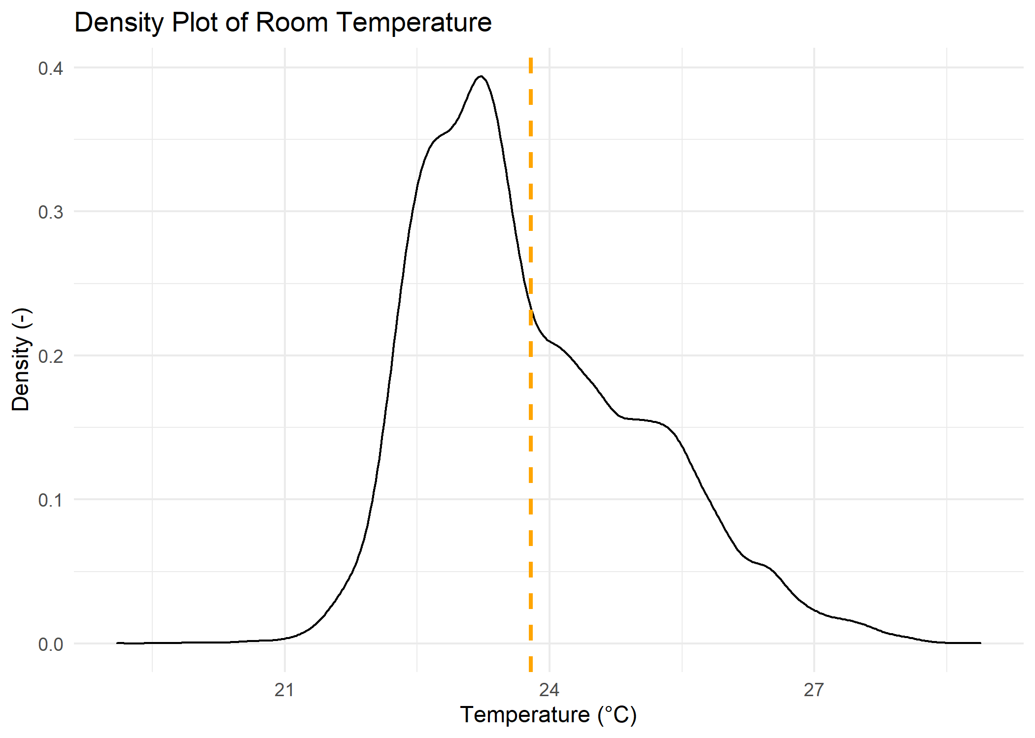
Figure 9.6: Density Plot Temperature
9.3.2 Data Basis
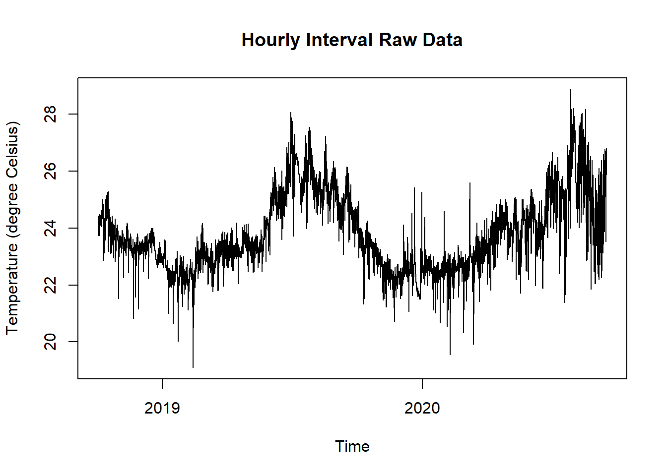
Figure 9.7: Raw Data Temperature for Density Plot
9.3.3 Solution
Create a new script, copy/paste the following code and run it:
library(ggplot2)
library(plotly)
library(dplyr)

# load time series data and aggregate daily mean values
library(dplyr)
library(lubridate)
# read and print data
df <- read.csv("https://github.com/hslu-ige-laes/edar/raw/master/sampleData/flatTempHum.csv",
                 stringsAsFactors=FALSE,
                 sep =";")

# select temperature and remove empty cells
df <- df %>% select(time, FlatA_Temp) %>% na.omit()

colnames(df) <- c("time", "value")

# static chart with ggplot
plot <- ggplot(df, aes(x = value)) +
  geom_density() +
  geom_vline(aes(xintercept = mean(value, na.rm = TRUE)),
             color = "orange",
             linetype = "dashed",
             size = 1,
             label = "Mean")+
  ggtitle("Density Plot of Room Temperature") +
  labs(x = "Temperature (\u00B0C)",
       y = "Density (-)") +
  theme_minimal()

# interactive chart
plotly::ggplotly(plot)