16.3 Building Energy Signature
16.3.1 Goal
You want to create a scatter plot with:
the daily mean outside temperature on the x-axis
the daily energy consumption on the y-axis
points colored according to season
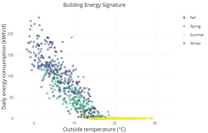
Figure 16.5: Building Energy Signature Plot
16.3.2 Data Basis
Two separate csv files with time series data from the outside temperature and the energy data with unaligned time intervals:
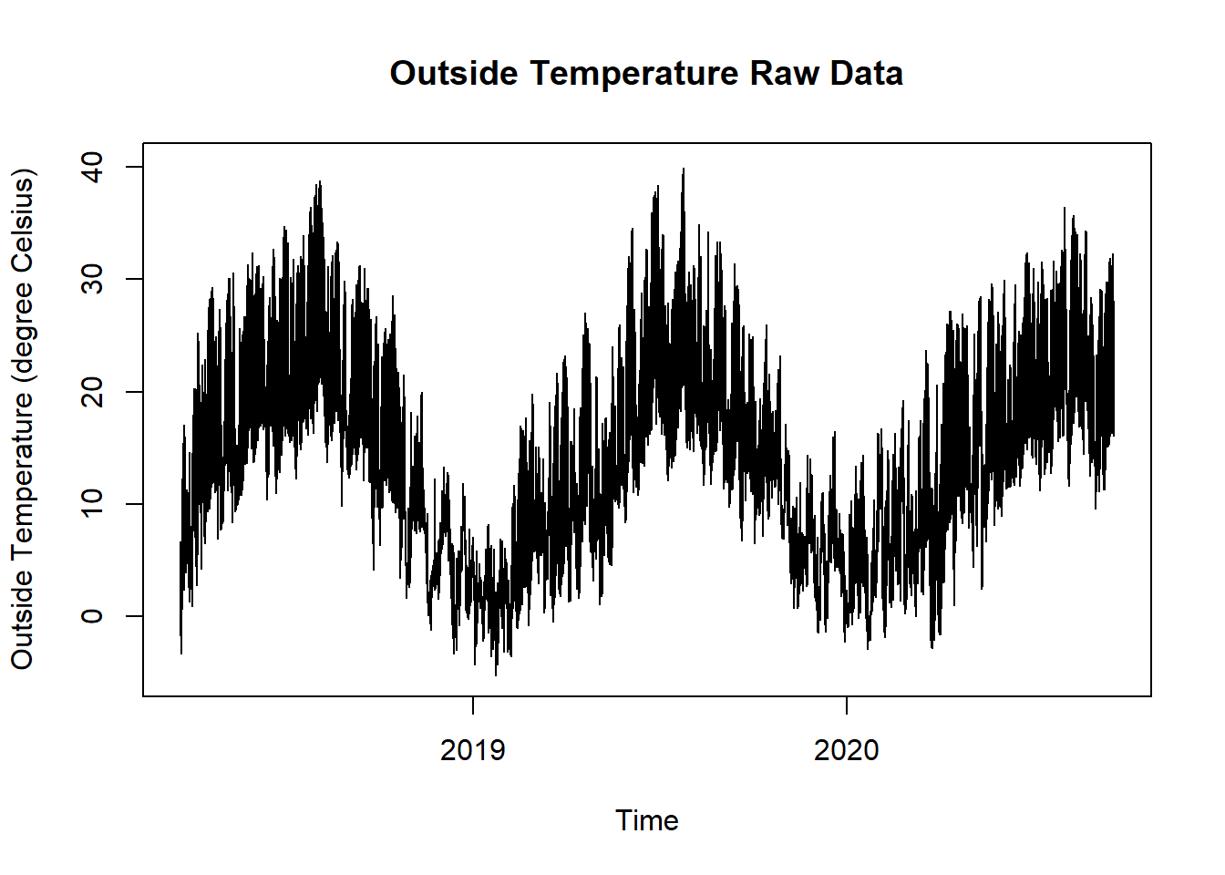
Figure 16.6: Outside Temperature Raw Data for Building Energy Signature Plot
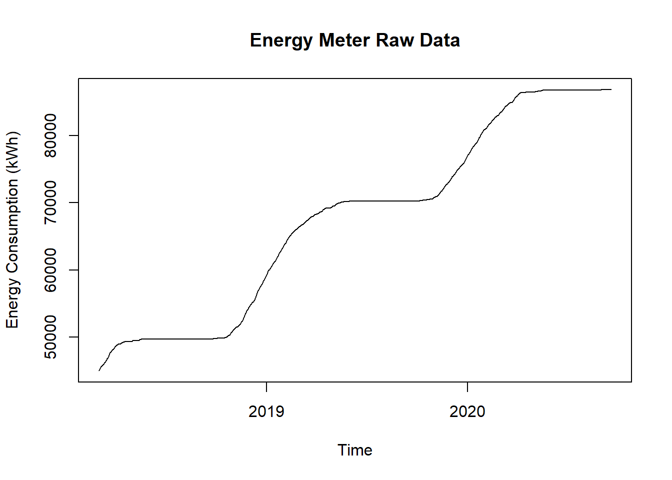
Figure 16.7: Energy Meter Raw Data for Building Energy Signature Plot
16.3.3 Solution
After reading in the two time series the data has to get aggregated per day and then merged. Note that during the aggregation of the energy data you have to calculate the daily conspumption from the steadiliy increasing meter values as well.
Create a new script, copy/paste the following code and run it:
library(ggplot2)
library(plotly)
library(dplyr)
library(redutils)
library(lubridate)

# load time series data and aggregate daily mean values
dfOutsideTemp <- read.csv("https://github.com/hslu-ige-laes/edar/raw/master/sampleData/centralOutsideTemp.csv",
                          stringsAsFactors=FALSE,
                          sep =";")

dfOutsideTemp$time <- parse_date_time(dfOutsideTemp$time,
                                      order = "YmdHMS",
                                      tz = "Europe/Zurich")

dfOutsideTemp$day <- as.Date(cut(dfOutsideTemp$time, breaks = "day"))
dfOutsideTemp <- dfOutsideTemp %>%
  group_by(day) %>%
  dplyr::mutate(tempMean = mean(centralOutsideTemp)) %>%
  ungroup()

dfOutsideTemp <- dfOutsideTemp %>%
  select(day, tempMean) %>%
  unique() %>%
  na.omit()

dfHeatEnergy <- read.csv("https://github.com/hslu-ige-laes/edar/raw/master/sampleData/centralHeating.csv",
                         stringsAsFactors=FALSE,
                         sep =";")

dfHeatEnergy <- dfHeatEnergy %>%
  select(time, energyHeatingMeter) %>%
  na.omit()

dfHeatEnergy$time <- parse_date_time(dfHeatEnergy$time,
                                     orders = "YmdHMS",
                                     tz = "Europe/Zurich")

dfHeatEnergy$day <- as.Date(cut(dfHeatEnergy$time, breaks = "day"))
dfHeatEnergy <- dfHeatEnergy %>%
  group_by(day) %>%
  dplyr::mutate(energyMax = max(energyHeatingMeter)) %>%
  ungroup()

dfHeatEnergy <- dfHeatEnergy %>%
  select(day, energyMax) %>%
  unique() %>%
  na.omit()

dfHeatEnergy <- dfHeatEnergy %>%
  dplyr::mutate(energyCons = energyMax - lag(energyMax)) %>%
  select(-energyMax) %>%
  na.omit()

# merge the data in a tidy format
df <- merge(dfOutsideTemp, dfHeatEnergy, by = "day")

# calculate season
df <- df %>% dplyr::mutate(season = redutils::getSeason(df$day))

# static chart with ggplot
plot <- ggplot2::ggplot(df) +
  ggplot2::geom_point(aes(x = tempMean,
                          y = energyCons,
                          color = season,
                          alpha = 0.1,
                          text = paste("</br>Date:  ", as.Date(df$day),
                                       "</br>Temp: ", round(df$tempMean, digits = 1), "\u00B0C",
                                       "</br>Energy: ", round(df$energyCons, digits = 0), "kWh/d",
                                       "</br>Season: ", df$season))
                      ) +
  scale_color_manual(values=c("#440154", "#2db27d", "#fde725", "#365c8d")) +
  ggtitle("Building Energy Signature") +
        theme_minimal() +
        theme(
          legend.position="none",
          plot.title = element_text(hjust = 0.5)
        )

# interactive chart
plotly::ggplotly(plot, tooltip = c("text")) %>%
  layout(xaxis = list(title = "Outside temperature (\u00B0C)",
                      range = c(min(-5,min(df$tempMean)), max(35,max(df$tempMean))), zeroline = F),
         yaxis = list(title = "Daily energy consumption (kWh/d)",
                      range = c(-5, max(df$energyCons) + 10)),
         showlegend = TRUE
         ) %>%
  plotly::config(displayModeBar = FALSE, displaylogo = FALSE)
16.3.4 Discussion
This visualization allows a quick detection of malfunctions and provides valuable information on the energy efficiency of the building.
A constant indoor temperature is assumed
It is also assumed that the outside temperature is the parameter with the greatest influence on heating energy consumption
This method is suitable for buildings with stable internal heat loads and relatively low passive solar heat loads