15.1 Mollier hx Diagram
15.1.1 Goal
You want to plot a mollier h-x diagram:
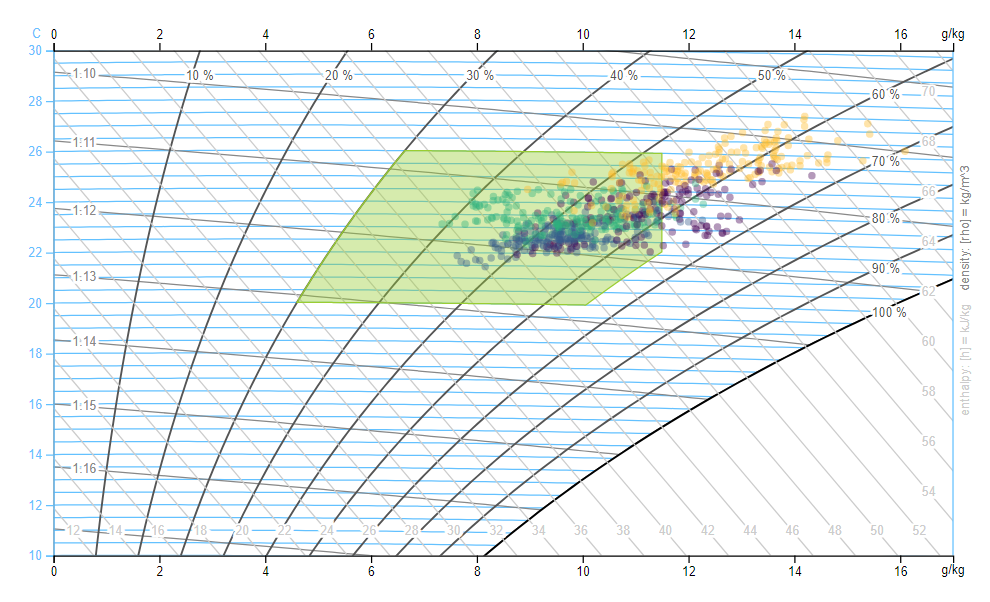
Figure 15.1: Mollier hx Diagram with comfort zone
15.1.2 Data Basis
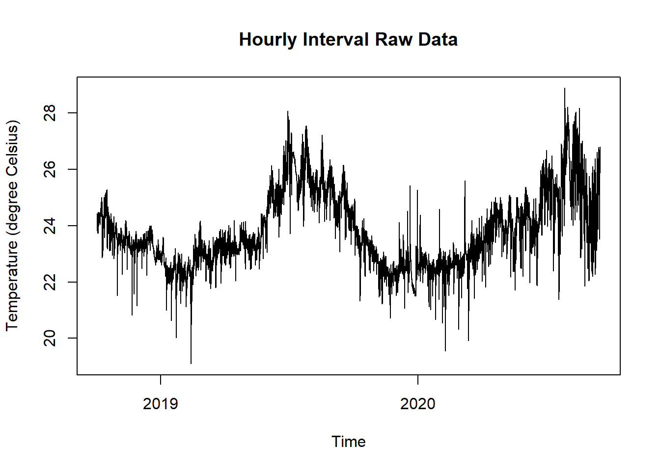
Figure 15.2: Raw Data Temperature and Humidity for Mollier hx Diagram
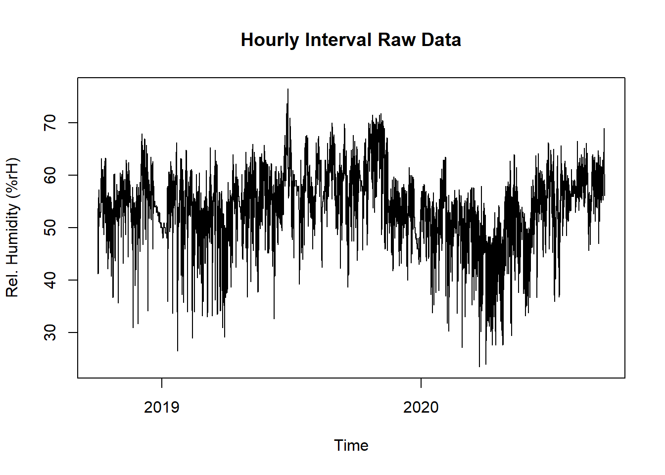
Figure 15.3: Raw Data Temperature and Humidity for Mollier hx Diagram
15.1.3 Solution
The sensor data is not in a constant intervall and not yet aggregated. So after reading in the time series the data has to get filtered and aggregated per day.
Finally use the plot function mollierHxDiagram from the redutils package (R Energy Data Utilities).
If you have not yet installed this package, proceed as follows:
Create a new script, copy/paste the following code and run it:
library(redutils)
library(dplyr)
library(lubridate)

# read and print data
data <- read.csv("https://github.com/hslu-ige-laes/edar/raw/master/sampleData/flatTempHum.csv",
                 stringsAsFactors=FALSE,
                 sep =";")

# select temperature and humidity and remove empty cells
data <- data %>% select(time, FlatA_Temp, FlatA_Hum) %>% na.omit()

# create column with day for later grouping
data$time <- parse_date_time(data$time, "YmdHMS", tz = "Europe/Zurich")
data$day <- as.Date(cut(data$time, breaks = "day"))

# calculate daily mean of temperature and humidity
data <- data %>%
  group_by(day) %>%
  summarize(tempMean = mean(as.numeric(FlatA_Temp)),
            humMean = mean(as.numeric(FlatA_Hum))
            ) %>%
  ungroup()

# plot mollier hx diagram
plot <- plotMollierHx(data)

# show plot
plot
15.1.4 See also
If you are interested in implementing this plot in your own dashboard you can check the free D3 implementation of it: https://github.com/hslu-ige-laes/d3-mollierhx