16.1 Electricity Household
16.1.1 Goal
You want to plot an electricity consumption diagram with:
- upper plot with daily energy consumption in kWh/day
- lower plot with standby-losses in Watts
Additionaly we would like to see the consumption of an average Swiss household.
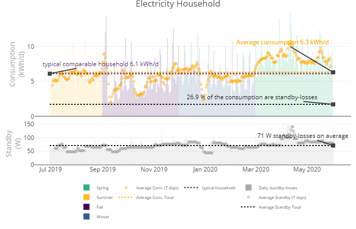
Figure 16.1: Plot Electricity Household
16.1.2 Data Basis
- A csv file with time series of an electric meter in 15 minute interval.
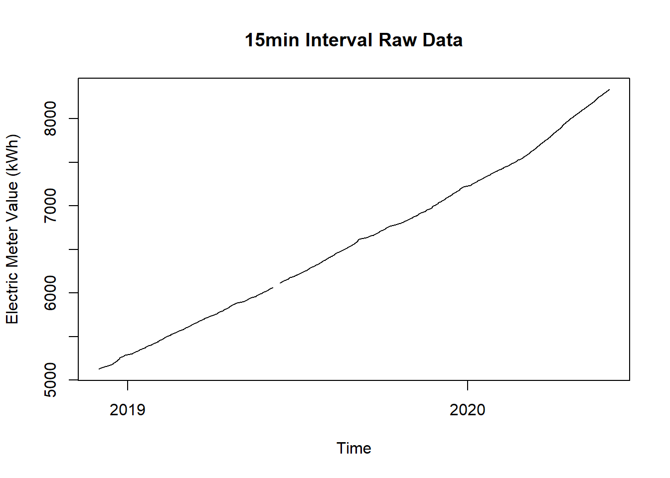
Figure 16.2: Raw Data for Electricity Household Plot
16.1.3 Solution
Create a new script, copy/paste the following code and run it:
library(redutils)
library(dplyr)
library(lubridate)
library(zoo)
library(plotly)

# load time series data and aggregate mean values
df <- read.csv("https://github.com/hslu-ige-laes/edar/raw/master/sampleData/flatElectricity.csv",
               stringsAsFactors=FALSE,
               sep =";")

df$time <- parse_date_time(df$time,
                           order = "YmdHMS",
                           tz = "UTC")

# select room
df <- df %>% select(time, FlatC_Ele)

# rename columns
colnames(df) <- c("timestamp", "meterValue")

# filter timerange
df <- df %>% filter(timestamp > "2019-07-01")

# Fill missing values with NA
grid.df <- data.frame(timestamp = seq(min(df$timestamp, na.rm = TRUE),
                                      max(df$timestamp, na.rm = TRUE),
                                      by = "15 mins"))
df <- merge(df, grid.df, all = TRUE)

# convert steadily counting energy meter value from kWh to power in kW
df <- df %>%
  dplyr::mutate(value = (meterValue - lag(meterValue))) %>%
  select(-meterValue)

# remove negative values which occur beause of change summer/winter time
df <- df %>% filter(value >= 0)

# determine date related parameters for later filtering
df$day <- as.Date(df$time, tz = "UTC")
df$week <- lubridate::week(df$time)
df$month <- lubridate::month(df$time)
df$year <- lubridate::year(df$time)

# data cleansing
# tag NA
df <- df %>% dplyr::mutate(deleteNA = ifelse(is.na(value),1,0))

# tag values below 0 and higher than 9.2 kW
df <- df %>% dplyr::mutate(deleteHiLoVal = ifelse(value > 9.2,1, ifelse(value < 0,1,0)))
# Assumption max. fuse 40 ampere (higher fuses for single family houses)
# this results in continuous power 9.2 kW
# this results in an hourly consumption of 9.2kWh
# over 24h = approx. 221 kWh max. consumption per day

# tag whole days which have one or more values to delete, keep only whole valid days
df <- df %>%
  group_by(day) %>%
  dplyr::mutate(delete = sum(deleteNA, na.rm = TRUE) + sum(deleteHiLoVal, na.rm = TRUE))

df <- df %>% ungroup()

# delete full days with invalid data
df <- df %>%
  filter(delete == 0) %>%
  select(-deleteNA, -deleteHiLoVal, -delete)

# determine season for later filtering
df <- df %>% dplyr::mutate(season = redutils::getSeason(timestamp))

# calculate sum and min per day
df <- df %>% dplyr::group_by(day) %>% dplyr::mutate(sum = sum(value))
df <- df %>% dplyr::group_by(day) %>% dplyr::mutate(min = min(value)*1000*4)
df <- df %>% ungroup()

df <- df %>% dplyr::select(day, sum, min, season) %>% unique()

df <- df %>% dplyr::mutate(ravgUsage = zoo::rollmean(x=sum, 7, fill = NA))
df <- df %>% dplyr::mutate(rminStandby = -1 * zoo::rollmaxr(x = -1 * min, 7, fill = NA))

typEleConsVal <- redutils::getTypEleConsHousehold(occupants = 2, rooms = 3.5, bldgType = "multi", laundry = "hotWaterSupply")/365


# Plot
main = "Electricity consumption private household"
minY <- 0
maxYUsage <- max(df %>% select(sum), na.rm=TRUE)
maxYUsage <- max(maxYUsage, typEleConsVal/365)
maxYStandby <- max(max(df %>% select(min), na.rm=TRUE), 0.25*maxYUsage/24*1000)
minX <- min(df$day)
maxX <- max(df$day)
averageUsage <- mean(df$sum, na.rm=TRUE)
averageStandby <- mean(df$rminStandby, na.rm=TRUE)
shareStandby <- nrow(df %>% select(sum) %>% na.omit()) * averageStandby * 24 / (1000 * sum(df$sum, na.rm=TRUE)) * 100

# legend
l <- list(
  orientation = "h",
  tracegroupgap = "20",
  font = list(size = 8),
  xanchor = "center",
  x = 0.5,
  itemclick = FALSE
)

fig1 <- df %>%
  plot_ly(x = ~day, showlegend = TRUE) %>%
  add_trace(data = df %>% filter(season == "Spring"),
            type = "bar",
            y = ~sum,
            name = "Spring",
            legendgroup = "group1",
            marker = list(color = "#2db27d", opacity = 0.2),
            hoverinfo = "text",
            text = ~ paste("<br />daily usage:              ", sprintf("%.1f kWh/d", sum),
                           "<br />rolling average:        ", sprintf("%.1f kWh/d", ravgUsage),
                           "<br />Average vis. points: ", sprintf("%.1f kWh/d", averageUsage),
                           "<br />Date:                        ", day,
                           "<br />Season:                   ", season
            )
  ) %>%
  add_trace(data = df %>% filter(season == "Summer"),
            type = "bar",
            y = ~sum,
            name = "Summer",
            legendgroup = "group1",
            marker = list(color = "#febc2b", opacity = 0.2),
            hoverinfo = "text",
            text = ~ paste("<br />rolling average:        ", sprintf("%.1f kWh/d", ravgUsage),
                           "<br />Average vis. points: ", sprintf("%.1f kWh/d", averageUsage),
                           "<br />Date:                        ", day,
                           "<br />Season:                   ", season
            )
  ) %>%
  add_trace(data = df %>% filter(season == "Fall"),
            type = "bar",
            y = ~sum,
            name = "Fall",
            legendgroup = "group1",
            marker = list(color = "#440154", opacity = 0.2),
            hoverinfo = "text",
            text = ~ paste("<br />rolling average:        ", sprintf("%.1f kWh/d", ravgUsage),
                           "<br />Average vis. points: ", sprintf("%.1f kWh/d", averageUsage),
                           "<br />Date:                        ", day,
                           "<br />Season:                   ", season
            )
  ) %>%
  add_trace(data = df %>% filter(season == "Winter"),
            type = "bar",
            y = ~sum,
            name = "Winter",
            legendgroup = "group1",
            marker = list(color = "#365c8d", opacity = 0.2),
            hoverinfo = "text",
            text = ~ paste("<br />rolling average:        ", sprintf("%.1f kWh/d", ravgUsage),
                           "<br />Average vis. points: ", sprintf("%.1f kWh/d", averageUsage),
                           "<br />Date:                        ", day,
                           "<br />Season:                   ", season
            )
  ) %>%
  add_trace(data = df,
            type = "scatter",
            mode = "markers",
            y = ~ravgUsage,
            name = "Average Cons. (7 days)",
            legendgroup = "group2",
            marker = list(color = "orange", opacity = 0.4, symbol = "circle"),
            hoverinfo = "text",
            text = ~ paste("<br />rolling average:        ", sprintf("%.1f kWh/d", ravgUsage),
                           "<br />Average vis. points: ", sprintf("%.1f kWh/d", averageUsage),
                           "<br />Date:                        ", day,
                           "<br />Season:                   ", season
            )
  ) %>%
  add_segments(x = ~minX,
               xend = ~maxX,
               y = ~averageUsage,
               yend = ~averageUsage,
               name = "Average Cons. Total",
               legendgroup = "group2",
               line = list(color = "orange", opacity = 1.0, dash = "dot"),
               hoverinfo = "text",
               text = ~ paste("<br />rolling average:        ", sprintf("%.1f kWh/d", ravgUsage),
                              "<br />Average vis. points: ", sprintf("%.1f kWh/d", averageUsage),
                              "<br />Date:                        ", day,
                              "<br />Season:                   ", season
               )
  ) %>%
  add_segments(x = ~minX,
               xend = ~maxX,
               y = ~averageStandby*24/1000,
               yend = ~averageStandby*24/1000,
               name = "Average Standby Total",
               legendgroup = "group3",
               showlegend = FALSE,
               line = list(color = "black", opacity = 1.0, dash = "dot"),
               hoverinfo = "text",
               text = ~ paste("<br />Average standby power:          ", sprintf("%.0f W", averageStandby),
                              "<br />equals to daily energy:         ", sprintf("%.1f kWh", averageStandby*24/1000),
                              "<br />Standby percent of total cons.: ", sprintf("%.0f %%", shareStandby)
               )
  ) %>%
  add_segments(x = ~minX,
               xend = ~maxX,
               y = ~typEleConsVal,
               yend = ~typEleConsVal,
               name = "typical household",
               legendgroup = "group4",
               line = list(color = "#481567FF", opacity = 1.0, dash = "dot"),
               hoverinfo = "text",
               text = ~ paste("<br />typical household:           ", sprintf("%.0f kWh/year", typEleConsVal*365),
                              "<br />equals to daily energy:      ", sprintf("%.1f kWh/day", typEleConsVal),
                              "<br />consumption of current flat: ", sprintf("%.1f kWh/day", averageUsage)
               )
  ) %>%
  add_annotations(
    x = minX,
    y = typEleConsVal,
    text = paste0("typical comparable household ", sprintf("%.1f kWh/d", typEleConsVal)),
    xref = "x",
    yref = "y",
    showarrow = TRUE,
    arrowhead = 7,
    ax = 100,
    ay = -20,
    font = list(color = "#481567FF")
  ) %>%
  add_annotations(
    x = maxX,
    y = averageUsage,
    text = paste0("Average consumption ", sprintf("%.1f kWh/d", averageUsage)),
    xref = "x",
    yref = "y",
    showarrow = TRUE,
    arrowhead = 7,
    ax = -100,
    ay = -60,
    font = list(color = "orange")
  ) %>%
  add_annotations(
    x = maxX,
    y = averageStandby*24/1000,
    text = paste0(sprintf("%.1f %%", shareStandby), " of the consumption are standby-losses"),
    xref = "x",
    yref = "y",
    showarrow = TRUE,
    arrowhead = 7,
    ax = -160,
    ay = -15,
    font = list(color = "black")
  ) %>%
  layout(
    title = main,
    xaxis = list(
      title = ""
    ),
    yaxis = list(title = "Consumption<br>(kWh/d)",
                 range = c(minY, maxYUsage),
                 titlefont = list(size = 14, color = "darkgrey")),
    hoverlabel = list(align = "left"),
    margin = list(l = 80, t = 50, r = 50, b = 10),
    legend = l
  )

fig2 <- df %>%
  plot_ly(x = ~day, showlegend = TRUE) %>%
  add_trace(data = df,
            type = "bar",
            y = ~min,
            name = "Daily standby-losses",
            legendgroup = "group3",
            marker = list(color = "darkgrey", opacity = 0.2),
            hoverinfo = "text",
            text = ~ paste("<br />daily standby:           ", sprintf("%.0f W", min),
                           "<br />rolling average:        ", sprintf("%.0f W", rminStandby),
                           "<br />Average vis. points: ", sprintf("%.0f W", averageStandby),
                           "<br />Date:                        ", day,
                           "<br />Season:                   ", season
            )
  ) %>%
  add_trace(data = df,
            type = "scatter",
            mode = "markers",
            y = ~rminStandby,
            name = "Average Standby (7 days)",
            legendgroup = "group3",
            marker = list(color = "darkgrey", opacity = 0.5, symbol = "circle"),
            hoverinfo = "text",
            text = ~ paste("<br />daily standby:           ", sprintf("%.0f W", min),
                           "<br />rolling average:        ", sprintf("%.0f W", rminStandby),
                           "<br />Average vis. points: ", sprintf("%.0f W", averageStandby),
                           "<br />Date:                        ", day,
                           "<br />Season:                   ", season
            )
  ) %>%
  add_segments(x = ~minX,
               xend = ~maxX,
               y = ~averageStandby,
               yend = ~averageStandby,
               name = "Average Standby Total",
               legendgroup = "group3",
               line = list(color = "black", opacity = 1.0, dash = "dot"),
               hoverinfo = "text",
               text = ~ paste("<br />Average standby power:          ", sprintf("%.0f W", averageStandby),
                              "<br />equals to daily energy:         ", sprintf("%.1f kWh", averageStandby*24/1000),
                              "<br />Standby percent of total cons.: ", sprintf("%.0f %%", shareStandby)
               )
  ) %>%
  add_annotations(
    x = maxX,
    y = averageStandby,
    text = paste0(sprintf("%.0f W", averageStandby), " standby-losses on average"),
    xref = "x",
    yref = "y",
    showarrow = TRUE,
    arrowhead = 7,
    ax = -60,
    ay = -20,
    font = list(color = "black")
  ) %>%
  layout(
    title = "Electricity Household",
    xaxis = list(
      title = ""
    ),
    yaxis = list(title = " Standby<br>(W)",
                 range = c(minY, maxYStandby),
                 titlefont = list(size = 14, color = "darkgrey"),
                 legend = list(orientation = 'h')),
    legend = l
  )

# calculate ratio which is visual representative for comparison
# ratio <- 1/maxYUsage * maxYStandby * 24 / 1000
ratio <- 0.3
fig <- subplot(fig1, fig2, nrows = 2, shareX = TRUE, heights = c(1-ratio, ratio), titleY = TRUE) %>%
  plotly::config(modeBarButtons = list(list("toImage")),
                 displaylogo = FALSE,
                 toImageButtonOptions = list(
                   format = "png"
                 )
  )
fig
16.1.4 See also
You probably noticed the line with the average consumption value. This gets calculated by the recommended values and formulas of the study Typischer Haushalt-Stromverbrauch - Schlussbericht by Nipkov, J. (2013)
You can find the implementation in redutils function getTypEleConsHousehold() where various parameters can get adapted via function call arguments.