11.4 Before/After Optimization
11.4.1 Goal
To highlight an energy optimization in a season diagram, we can gray out the seasons before the optimization and only highlight the monthly values after the optimization. To better quantify the success, we can calculate and display the confidence interval of the years before.
We will create the following plot:
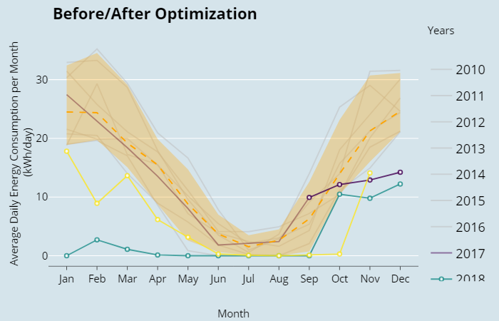
Figure 11.8: Seasonal Plot Overlapping Before/After
11.4.2 Data Basis
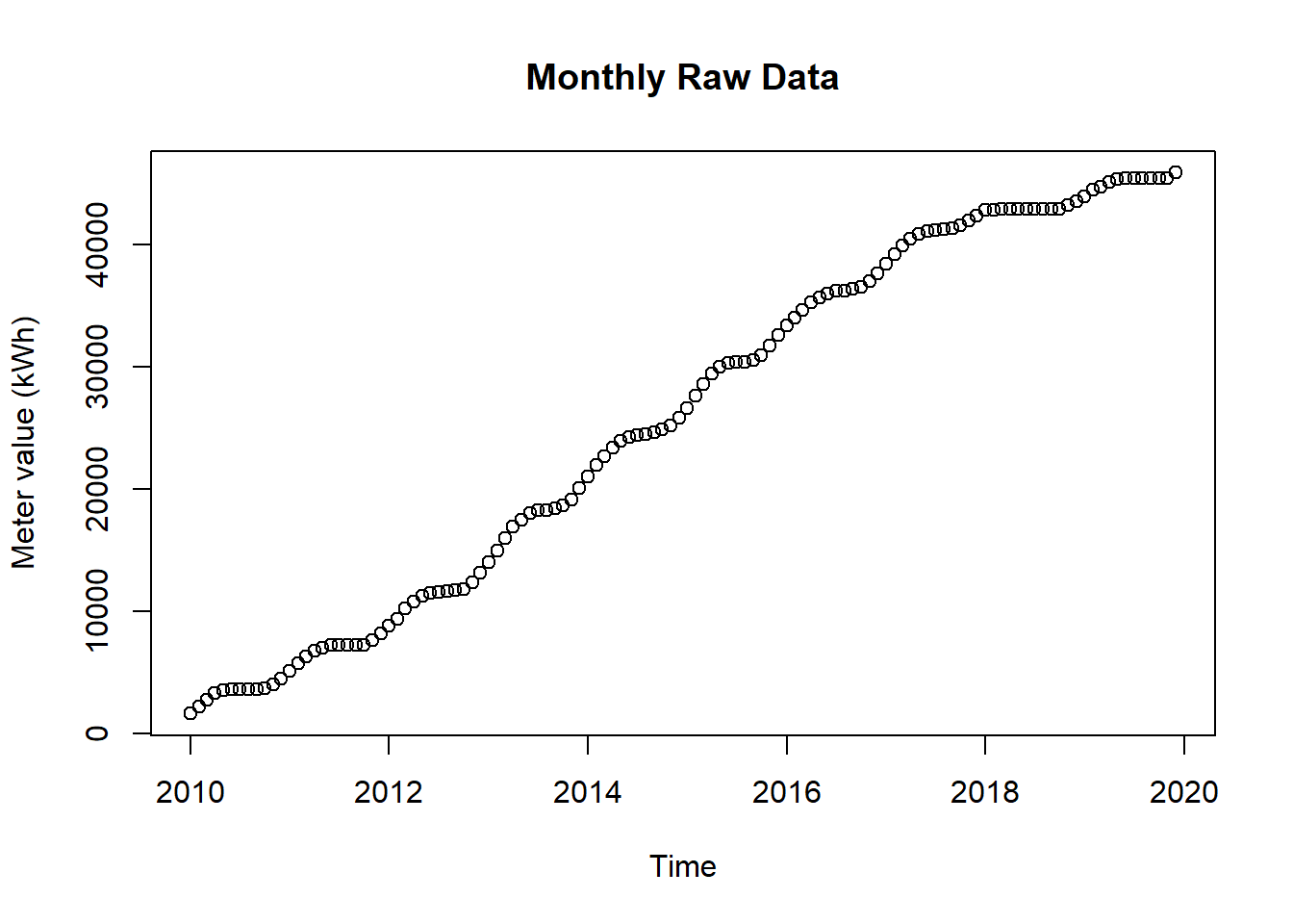
Figure 11.9: Raw Data for Seasonal Plot Overlapping Before/After Optimization
11.4.3 Solution
Create a new script, copy/paste the following code and run it:
library(redutils)
library(dplyr)
library(plotly)
library(htmlwidgets)
library(ggthemes)

# load csv file
df <- read.csv2("https://github.com/hslu-ige-laes/edar/raw/master/sampleData/flatHeatAndHotWater.csv",
                stringsAsFactors=FALSE)

# filter flat
df <- df %>% select(timestamp, Adr02_energyHeat)

colnames(df) <- c("timestamp", "meterValue")

# calculate consumption value per month
# pay attention, the value of 2010-02-01 00:00:00 represents the meter reading on february first,
# so the consumption for february first is value(march) - value(february)!
df <- df %>% dplyr::mutate(value = lead(meterValue) - meterValue)

# remove counter value column and calculate consumption per day instead of month
df <- df %>%
  select(-meterValue) %>%
  mutate(value = value /lubridate::days_in_month(timestamp))

# value correction (outlier because of commissioning)
df[1,2] <- 19

# create plot
plot <- plotSeasonalXYBeforeAfter(df,
                                  dateOptimization = "2017-09-01",
                                  locTimeZone = "Europe/Zurich",
                                  main = "Before/After Optimization",
                                  ylab = "Average Daily Energy Consumption per Month \n(kWh/day)\n"
                                  )

# change theme (optional)
plot <- plot + ggthemes::theme_economist()

# make plot interactive (optional)
plotly <- plotly::ggplotly(plot)

# show plot
plotly11.4.4 Discussion
One can clearly see the impact of the optimization in mid-2017
And as well the too low setting of January 2018 where the thermostat of the flat got deactivated
The confidence band shows as well the year 2013 which had an unusual high consumption from February to June