Visualization(s)
Temperature Flats with Average, Setpoint and resulting Difference
A simple overview of the time series data per room.
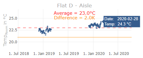
- The orange solid line represents the room temperature setpoint which can be changed in the extended settings (see below)
- The red dashed line represents the average value of the room. It takes the season- and time range selection into account.
- Tooltip: Place the mouse pointer over a datapoint to get more information of a specific measurement.
Boxplot
A standard Boxplot to get a compact overview of all flats/rooms.
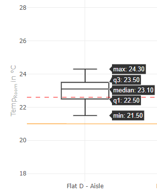
- The orange solid line represents the room temperature setpoint which can be changed in the extended settings (see below)
- The red dashed line represents the average value of the room. It takes the season- and time range selection into account.
- Tooltip: Place the mouse pointer over a datapoint to get more information of a specific measurement.
Settings
Basic
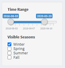
Time Range
- The date left is automatically the oldest timestamp and on the right side the newest.
- Narrow the time range to make comparisons.
Visible Seasons
- The points are colored according to the season.
- With the checkboxes the measurements of a season can be shown and hidden individually.
Extended
- To access the extended settings, the plus symbol in the upper right corner of the title bar must be pressed.
- Per default the extended settings tab is collapsed.
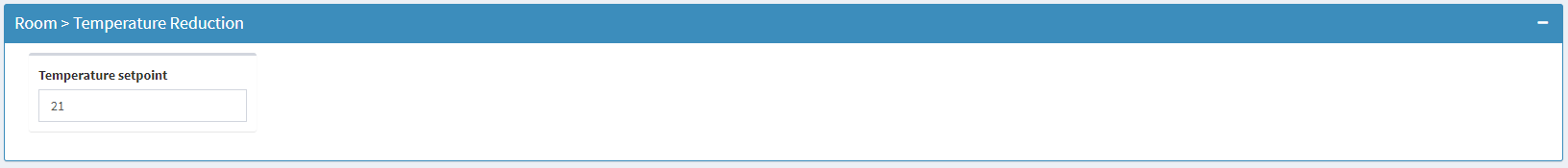
Temperature Setpoint
- Changes will move the horizontal lines in the plots around and trigger a new calculation of the temperature differences.
References
none