Visualization(s)
CO2 Flats with Indoor Air Quality Zones
Standard time series x-y plot with band of upper- and lower quantiles (0.05 and 0.95).
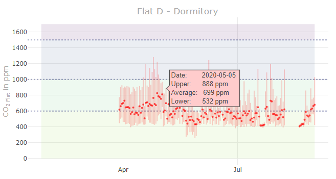
- The x-axis represents the time and the y-axis the air quality value in ppm.
- The four zones helps to indicate whether measured air qualities are within a comfortable range or not.
- The amount of displayed charts is depending on the amount of configured sensors in
Settings > Data Points - Tooltip: Place the mouse pointer over a datapoint to get more information of a specific measurement.
Settings
Basic
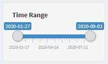
Time Range
- The date left is automatically the oldest timestamp and on the right side the newest.
- Narrow the time range to make comparisons.
Extended
- To access the extended settings, the plus symbol in the upper right corner of the title bar must be pressed.
- Per default the extended settings tab is collapsed.
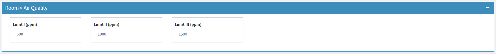
Limit I to III
- The three ppm values represent the three lines in the chart.
- Default values from [2].
References
[1] Frank, W. (1975). Raumklima und thermische Behaglichkeit: Literaturauswertung, durchgeführt im Auftr. d. Bundesmin. f. Raumordnung, Bauwesen u. Städtebau. Berichte aus der Bauforschung: H. 104.
[2] Schweizerischer Verein Luft- und Wasserhygiene (2019). Messgerate_fur_Raumluft.pdf - Das ist gutes Raumklima. Retrieved August 31, 2020, from https://www.svlw.ch/