Visualization(s)
Room Temperature versus relative Humidity
Such visualizations have existed for more than 45 years and were shown e.g. by Frank (1975) [1] in a report.
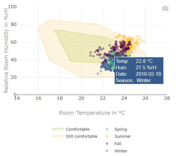
- The x-axis represents the room temperature and the y-axis the relative humidity.
- The two zones helps to indicate whether measured temperature/humidity values are within a comfortable, still comfortable range or not.
- Tooltip: Place the mouse pointer over a datapoint to get more information of a specific measurement.
Mollier hx-Diagram
The Mollier h,x-diagram was proposed by Richard Mollier in 1923 [2] allows to describe changes of state of humid air. In the present case it is used to show comfort states regarding temperature and humidity.
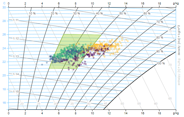
This visualisation is written in D3 and open-source [3]
- It is valid for a certain air pressure. The lcm application calculates the air pressure from the building altitude (meters above sea level) which you can change in the settings
Settings > App Configuration. - The basic scale for the h,x-diagram is a temperature scale, which is applied vertically as y-axis.
- The auxiliary lines drawn horizontally from left to right are the “isotherms”, i.e. lines with constant air temperature. While the isotherm at 0 °C runs parallel to the horizontal axis, the isotherms at higher temperatures will increasingly rise to the right, due to the heat content of the increasing water content.
- The x-axis represents the water content x resp. the absolute humidity of the air.
- The comfort zone helps to indicate whether measured temperature/humidity values are within a comfortable range or not.
- Measured values get integrated as scatter plot and are coloured according to the season (winter, spring, summer, fall).
- Using the building altitude, temperature and relative humidity the application calculates the absolute water content.
- A dot stands for a daily averaged state.
Settings
Basic
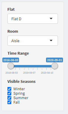
Flat and Room
- Selection of flat resp. room which should get analyzed.
- According to the building hierarchy all flats and rooms get listet which have a datapoint of type “tempRoom” or “humRoom”.
Time Range
- The date left is automatically the oldest timestamp and on the right side the newest.
- Narrow the time range to make comparisons.
Visible Seasons
- The points are colored according to the season.
- With the checkboxes the measurements of a season can be shown and hidden individually.
Extended
- To access the extended settings, the plus symbol in the upper right corner of the title bar must be pressed.
- Per default the extended settings tab is collapsed.
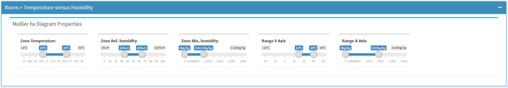
“Mollier hx”-Diagram Properties
- The three sliders in the upper line change the comfort zone.
- The two sliders in the lower line change the ranges of the x- and y-axis
References
[1] Frank, W. (1975). Raumklima und thermische Behaglichkeit: Literaturauswertung, durchgeführt im Auftr. d. Bundesmin. f. Raumordnung, Bauwesen u. Städtebau. Berichte aus der Bauforschung: H. 104.
[2] Mollier-h-x-Diagramm (n.d.). In Wikipedia. Retrieved August 28, 2020, from https://de.wikipedia.org/wiki/Mollier-h-x-Diagramm
[3] d3-mollierhx (n.d.). In Github. Retrieved August 28, 2020, from https://github.com/hslu-ige-laes/d3-mollierhx